" height="15.6252px" id="kHQK46d1y" transform="translate(0.625 1.875)" width="18.75px"/></g></g></svg>)

Overview
Overview
Background
Background
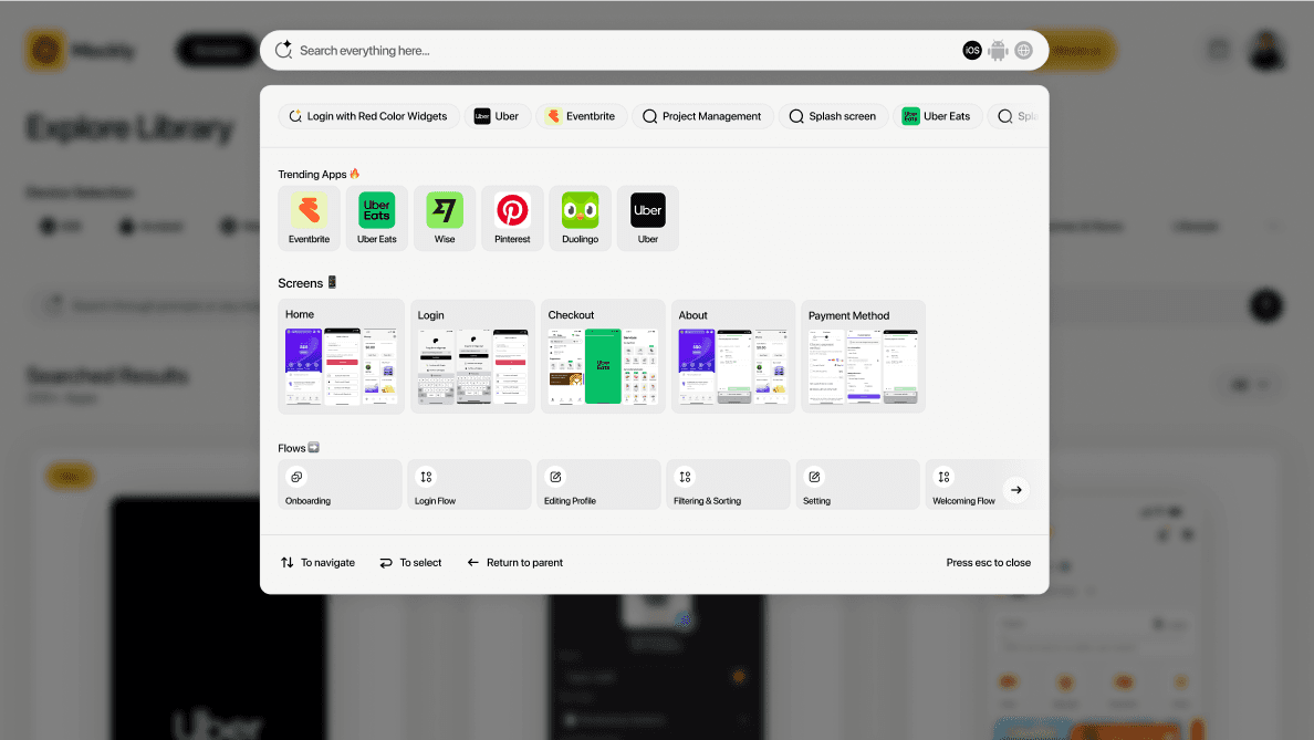
Mockly is a living inspiration library built for product designers. It continuously captures meaningful UI screenshots from production apps and websites using an autonomous capture pipeline, annotates each capture with design‑aware descriptors, and exposes an intent‑led search.
Mockly is a living inspiration library built for product designers. It continuously captures meaningful UI screenshots from production apps and websites using an autonomous capture pipeline, annotates each capture with design‑aware descriptors, and exposes an intent‑led search.
The challenge
The challenge
Library coverage: existing libraries are too small and lack real-world app variety, making them unreliable for modern product work.
Library coverage: existing libraries are too small and lack real-world app variety, making them unreliable for modern product work.
Scale velocity: building the largest, high-quality app collection fast is critical, but speed risks inconsistency and gaps in coverage.
Scale velocity: building the largest, high-quality app collection fast is critical, but speed risks inconsistency and gaps in coverage.
Semantic discovery: as the library grows, keyword search breaks down — we need best-in-class semantic search that understands intent, patterns, and use cases, not just screen labels.
Semantic discovery: as the library grows, keyword search breaks down — we need best-in-class semantic search that understands intent, patterns, and use cases, not just screen labels.

The Full Story
The Full Story
Starting with the idea
Starting with the idea
The initial idea was simple: What if designers could search real app screenshots the same way they search thoughts in their head? Most inspiration tools rely on static uploads or manual curation. I wanted Mockly to feel fast, visual-first, and intentional.
The initial idea was simple: What if designers could search real app screenshots the same way they search thoughts in their head? Most inspiration tools rely on static uploads or manual curation. I wanted Mockly to feel fast, visual-first, and intentional.
Early flows & mental models
Early flows & mental models
Before wireframes, I focused on flows and mental models. I mapped a simple journey: search → scan → compare → save. The flow was intentionally short—if a designer can’t find something useful in under a minute, the product fails.
Before wireframes, I focused on flows and mental models. I mapped a simple journey: search → scan → compare → save. The flow was intentionally short—if a designer can’t find something useful in under a minute, the product fails.
Where I got stuck
Where I got stuck
Early flow diagrams became messy very quickly. Too many branches, too many states. Search, filters, compare, save — all competing for attention. The problem wasn’t the features; the problem was everything was treated as equal.
Early flow diagrams became messy very quickly. Too many branches, too many states. Search, filters, compare, save — all competing for attention. The problem wasn’t the features; the problem was everything was treated as equal.
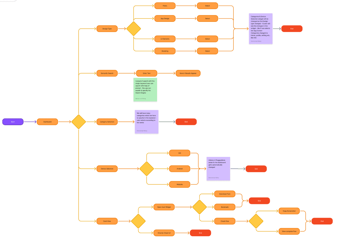
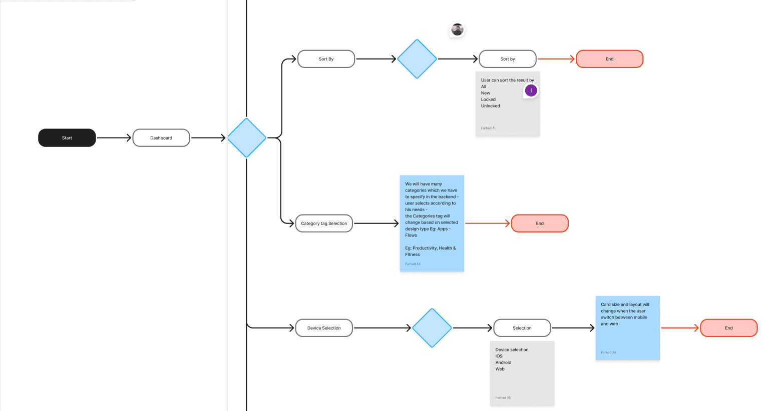
Simplifying the flows
Simplifying the flows
To unblock the flow design, I made a key decision: searching is primary, everything else is secondary. This led to three core flows—Search → Results → Preview, and Results → Save. Anything that didn’t support these flows was removed or deferred. Once this hierarchy was clear, the flow diagrams became simpler and easier to reason about.
To unblock the flow design, I made a key decision: searching is primary, everything else is secondary. This led to three core flows—Search → Results → Preview, and Results → Save. Anything that didn’t support these flows was removed or deferred. Once this hierarchy was clear, the flow diagrams became simpler and easier to reason about.
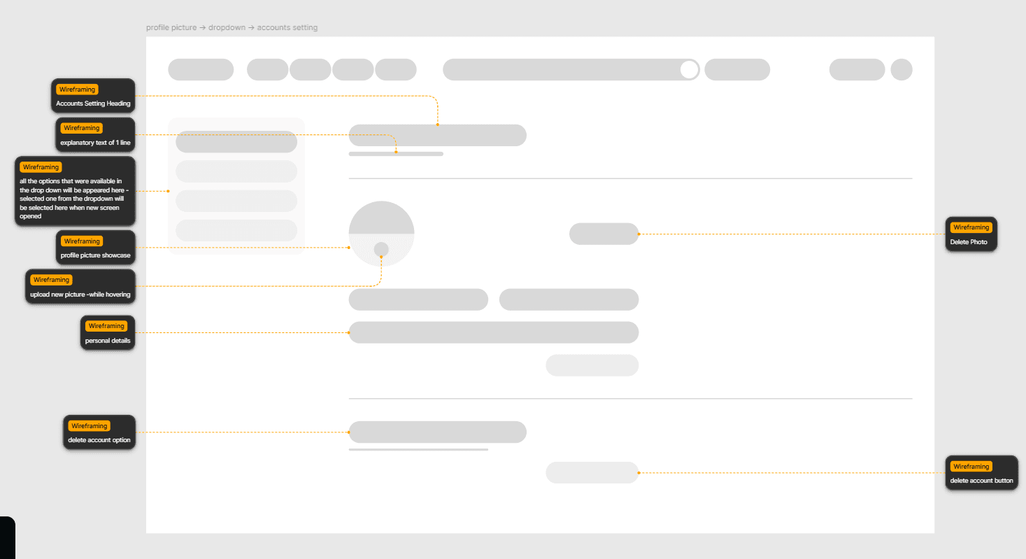
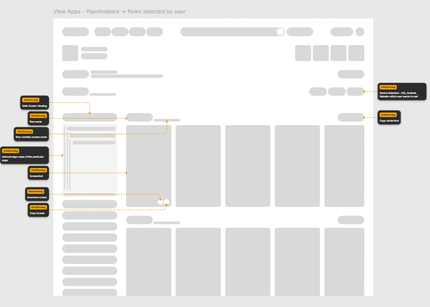
Wireframes: structure before visuals
Wireframes: structure before visuals
With clear flows, I moved into low-fidelity wireframes. Focus areas: Large visual thumbnails (scanning > reading), minimal text, and actions placed close to visuals. I tested structure, not polish, sharing wireframes with designers to confirm that they want to see first, and decide second.
With clear flows, I moved into low-fidelity wireframes. Focus areas: Large visual thumbnails (scanning > reading), minimal text, and actions placed close to visuals. I tested structure, not polish, sharing wireframes with designers to confirm that they want to see first, and decide second.


High-fidelity design decisions
High-fidelity design decisions
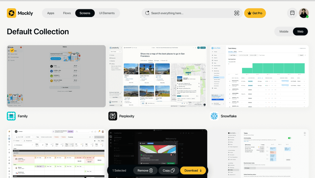
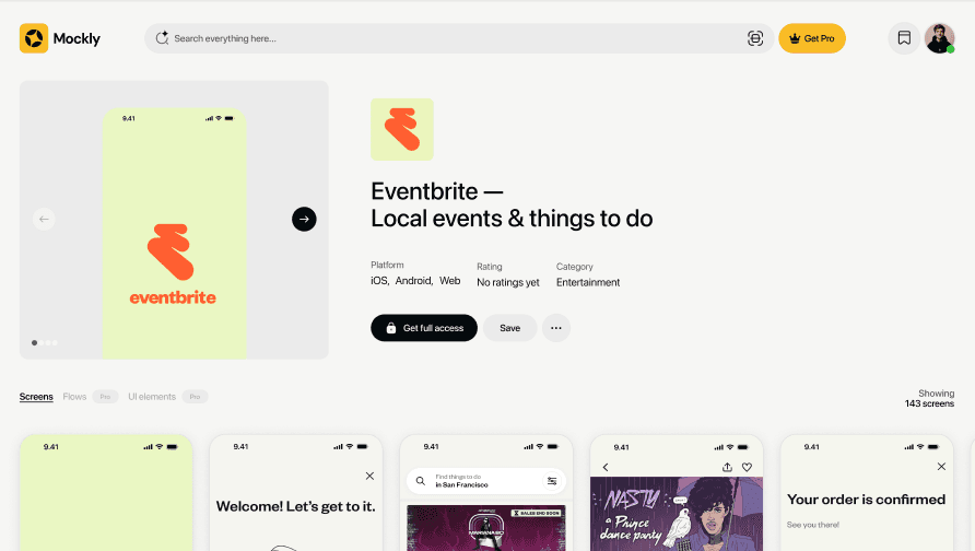
High-fidelity design focused on reducing friction. Key decisions: a neutral/light background to keep colors accurate, soft device frames for context without distraction, and a clear visual hierarchy—image → purpose → actions. A focused preview replaced comparison, allowing designers to act quickly.
High-fidelity design focused on reducing friction. Key decisions: a neutral/light background to keep colors accurate, soft device frames for context without distraction, and a clear visual hierarchy—image → purpose → actions. A focused preview replaced comparison, allowing designers to act quickly.

Componentization system
Componentization system
To keep the design scalable, I introduced a lightweight component system: Screenshot card, Compare panel, Collection tile, and Action bar. This ensured faster iteration and a clean handoff to engineering with defined spacing rules and states.
To keep the design scalable, I introduced a lightweight component system: Screenshot card, Compare panel, Collection tile, and Action bar. This ensured faster iteration and a clean handoff to engineering with defined spacing rules and states.


What's next?
Mockly v1 set the foundation. The evolution of the product focuses on bridging the gap between inspiration and implementation.
Mockly v1 set the foundation. The evolution of the product focuses on bridging the gap between inspiration and implementation.
AI Design Copilot
AI Design Copilot
Moving beyond search to generation—using our library of production UI to help designers generate low-fi wireframe drafts based on a text prompt.
Moving beyond search to generation—using our library of production UI to help designers generate low-fi wireframe drafts based on a text prompt.
Collaborative Boards
Collaborative Boards
Turning private collections into shared team moodboards with real-time feedback and direct Figma linking.
Turning private collections into shared team moodboards with real-time feedback and direct Figma linking.
Copy email